


Coimbatore's Branding & Design Powerhouse
"We don't just Design— We bring Brands to Life. From bold Brand Identities to stunning Websites and game-changing Digital Campaigns, our creative canvas is unlimited."
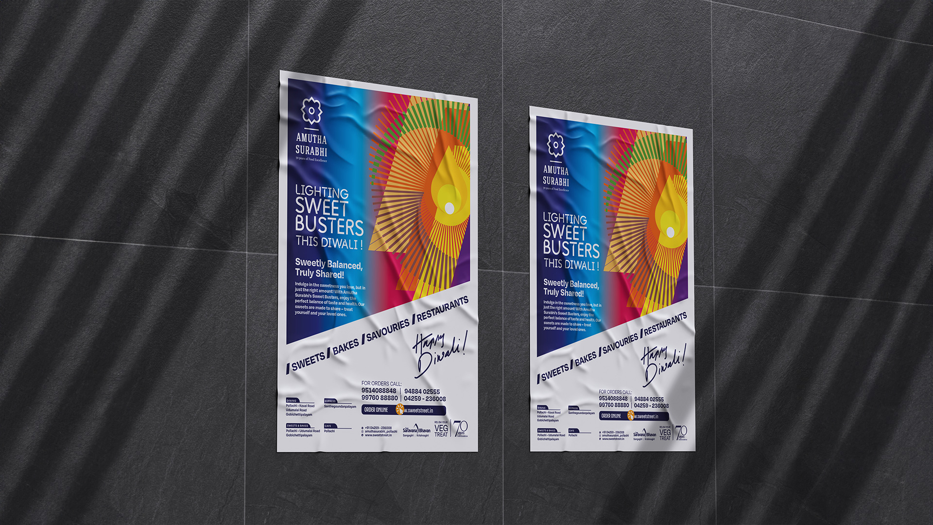
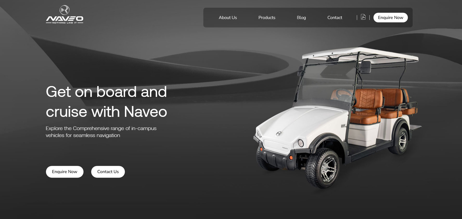
As a leading branding agency in Coimbatore, we blend creativity with strategy to design unforgettable identities, stunning visuals, and powerful digital experiences. Whether it's graphic design, web development, or digital marketing, we craft solutions that make your brand stand out. With 25+ years of expertise, we've helped businesses grow, engage, and shine.


.gif)